What is the material design? It was developed by Google set of styles and graphics, as well as the guidelines and rules for the implementation of these styles. First material design was featured on the developer conference, Google I / O ,in the summer of 2014. At the heart of the style format “cards” and “blocks” – a simple and concise form and graphic elements, as well as the overall simplicity and freshness of design – quiet, soft colors, the lack of volume, small parts and detail in general. The first “the publication” for material design held together with the launch of the service Google Now, style and officially became the basis for the Android operating system as recently as version 5.0, also known as Android Lollipop.
In my opinion, material design has several important advantages over all previous attempts to bring Google design of its operating system and software for it to a single mind, but also some disadvantages. In this short article I will try to present their views on the new design language from Google.
Material design – Case for
The first and most important argument in favor of a new style, in my opinion – its execution. Do not want to re-appear hater technology and approach Apple, but in this case it’s not scary, because I express a point of view. So, in my view, to update the seventh version of iOS and Android update to the fifth version – is, as they say, two big differences.
In the case of Apple, we saw a regular shift schedules in the previous flat view, no new ideas, no desire to bring something fresh – just took the existing interface, surrendering his press, redrawn icons and added a rainbow background pictures. That is the background image in the new iOS 7 and transparency effects menu – an indicator of tastelessness and the reluctance of designers to do something good and kind, I think. In the “seven” all just splurged beautiful animation effects, and the overall brightness of the new interface. About that, whether it is convenient, it seems to me, one much thought because otherwise Apple designers would have paid more attention to functional aspects, not the rainbow design.
Curtain notifications caused the top, and the control panel, it is called bottom – illustrative examples of useless “upgrade” in iOS7. The first and did not clear – all the notifications in a handful of porridge, and too many of them, the second half did, switches allow enabling / disabling interfaces, but does not proceed to set them up and the choice of networks
Android 5.0 also updated very seriously in terms of graphics compared to 4.x in connection with the transfer of the operating system on the material design. And, at first glance, the changes are similar to those that occurred in the iOS – Final change of style on a flat, generally lighter design, outward simplicity. But beyond the differences begin. In Android 5.0 interface is more holistic just through material design – all done in a quiet style, nothing stands out and does not look gaudy or too bright. The basic principle of material design eliminates priority graphic effects in the interface before it practical? and it’s great.
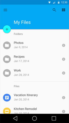
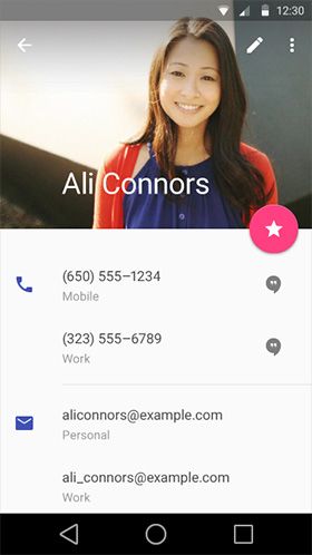
If you sum up the first argument – material design looks already very holistically, that is exactly what was missing operating system from Google and KO – integrity and community. When opening a particular program, be it contacts, browser, email client, or something else, you see the same animation, same color palette and simply recognizable elements. Due to this, a new operating system is easier to learn and it’s just nice to work with.
The second argument – if you already use a smartphone on Lollipop or seen screenshots, you have probably noticed that the visual interface is consolidated. Enlargement of the interface is in sensor devices for a long time. If you compare the first version of Android with “then» Windows Mobile – it is obvious that Android was larger and easier on the screen puts less information, but also to control the smartphone was more convenient. In the material design some elements are replaced by “card”, slightly enlarged fonts, sizes and rows of icons, the interface as a whole has become larger. I like it, probably because I’m getting old, jokes aside, the older, the less desire to look into “milipizernye” icons and elements, even with good vision. By the way, that’s why I do not like the iPhone 5 and anything less.Compactness Compact but even on the screen with a diagonal of 4.5 ” I want to see the normal size of the element, not to study it with a magnifying glass. It is trite convenient in many situations, especially when dealing with a smartphone on the go, for example. Therefore, the general coarsening of the interface in Android 5.0 on the basis of material design seems to me a good step.
The third argument for – Google is not simply transferred to the new Android design, but immediately prepared the necessary visual guide demonstrating the implementation of the basic elements for software developers. Simply put, if you make a new program or want to transfer old to new design you site and examine the recommendations of Google.
Here , for example, says, what colors to use. It shows the fonts and how to use them. And here recommendations for the use of graphic images in the correct program.
Material design – Arguments against
However, the third argument in favor of the material design is also the argument against. Yes, Google fellows that did not throw the developers and provide them with a comprehensive guide to the correct use of the new design language, but about the users in this case, so to speak, could not think. Programs written in all material design rules or changes in the external leadership on Google, will look very harmonious in the Android 5.0 and not – in earlier versions of the system. And vice versa – all applications that do not meet the rules of material design, smartphone with Android Lollipop will look somewhat alien. And such programs in the next six months will be quite a few, I would venture to guess. Still, not every developer of popular programs, especially if it is complex and requires constant updates and improvements to drop everything and start to translate it into the material design.
An illustrative example of a very old design the actual program – WhatsApp. How long the application will not translate into md? Good question
It turns out that part of the developers now really dropped everything and translate their programs in material design, and others – no.And on Google Play has programs in older, say, the design, but also sometimes necessary in the work. In the end, it turns out that one wishes Google (undoubtedly correct!) To bring Android to the general form is not enough, you need something to do with the hundreds of thousands of programs. The question is – what?
Dear readers, what do you think of the idea to bring all of your Google services and applications to the general form, using as a base material design?
Material design from Google - for and against
No comments:
Post a Comment